

How would you describe your job as a cover designer?
I am paid to read great books and interpret them. I have the greatest job in the world.
Do you feel any particular responsibilities to the book, author, and/or publishers?
My job as book designer and art director is predicated on the idea that I will help sell a book, and to the extent that I do that, successfully position a book in the marketplace by making the appropriate jacket for it, I am fulfilling my responsibilities to the publisher.
In terms of my responsibility to the author and the book…representing the text is not (at least not patently) something I’m paid to do, but I see this act as a moral imperative. Characterizing, explicating, interpreting a text visually is the most interesting and gratifying aspect of what I do. When I fail at this task of signifying what a book is (or I am urged or directed in some way to betray what I see as a book’s essential nature) there’s a palpable sense of loss and guilt. It feels important to me that a book’s cover should not be dissonant with, or oblivious to, the text within. A book cover should be a book’s true face; which is to say, optimally, a jacket or cover will be a kind of visual translation of the book in question. So—to the extent that I successfully describe or epitomize a book—its plot, its themes, its affect…I am fulfilling my responsibilities to the book and to its author.
What makes for a successful cover design?
 A good cover should sell a book, and adequately represent what it is. It should work to entice a browser, and serve as a lasting emblem of the experience of having read a given text. There’s no formula for how to accomplish this. Which is to say that every good book cover is as unique as the text it is wrapping. But there are certain general rules of thumb I think a designer could cleave to: a good book cover should be pretty, or visually stimulating in some way— and it should look different from every other book cover around it. I count originality highest of all cover-design virtues.
 What makes for an unsuccessful cover design?
I can’t stand covers which imitate other covers, or which slavishly look like whatever their designated genre is supposed to look like. I really dislike any cover that is a cliché, or that consists of clichés. There are visual clichés, tropes for every genre we publish—crime, chick lit, horror, history, science… even (or even especially) literary fiction…
A new book needs first and foremost to catch a browser’s eye, and, in order to do so, the cover has to stand out in some way. (Things stand out, tautologically, by looking distinctive, different from what's amassed around them). I can’t stress this point enough. There are so many books published every year, and so many of their covers look alike. Don’t they?
This is, of course, a product of a kind of insularity in the publishing business, the ways in which publishing is an echo chamber. But it’s also a product of a marketing culture that can exist anywhere, which can think of no better methodology than imitation. There is a fundamental fear that underlies many of the decisions made around book jackets; in this market, publishers want covers they think are safe bets—ie covers that are similar to other covers that have worked in the past. Unfortunately, by dictating that designers produce genre-ready, hackneyed, copycat covers, publishers are insuring just the opposite of their intent: they are insuring that a book will get lost amid the clones (or at the very least they are insuring that the jacket won’t be helping to make the sale).
I prefer ugly covers to clone covers. At least ugly covers demand a certain amount of attention.
What is your design process?

I get the manuscript from the editor or author—and I read it. (Sometimes twice.)
That’s the lion’s share of the work. Something tends to happen to me during the reading process—a visual idea will occur; something that can visually epitomize the entire text…
…then I sketch the idea quickly on paper…
…and then comes the process of actualizing that sketch. When I’m at the office I play with typography and color, and shape, maybe I experiment with photography or I’ll draw something, or collage something…sometimes it’s all done on the computer, sometimes all on paper...the construction stage of this process is very unscripted. I’ll just continue to make things until the idea is realized as well as it can be.
Besides other book covers, what influences your design?
 Anything is a potential catalyst for a cover idea; the stimulus can come from anywhere. But one has to be on the lookout. I don’t think inspiration is something you passively receive. I’m always looking—everywhere. And there are certain kinds of visual acts which I’m always hoping to stumble upon. Unusual juxtapositions, surprising color combinations, new modes of visual expression…I am always interested by anything graphical that strikes me as (this is difficult to put into words) excitingly wrong. There is a cool-factor to certain images that lie just on this side of disagreeable…pictorial effects that make me think “this will bother a lot of unimaginative people.” Whenever I see something like that, a piece of art or graphic design that has that special kind of wrongness about it, I think “I need to do something like this myself.” Attendant to this is always the feeling of “in the future, this will be done a lot.” In other words, today’s ugly is tomorrow’s beautiful. The cover I made for Simone de Beauvoir’s The Woman Destroyed came out of this impulse. It’s ugly, but hopefully it’s interesting, and arresting. Hopefully!
 Do you draw from art, advertising, pop culture? Is there anything you try to block out when working on a cover?
I definitely try to stay attuned to the fine arts world, though I don’t have a lot of time to see exhibitions. I’m not as plugged into the popular culture as I could be. (The positive side of this is that I can’t be accused of doing anything trendy.) The only things I consciously block out are ideas or images I’d deem stale or commonplace.
Is there a difference between designing a cover for a new book and re-designing a cover for a classic, like the covers you’ve done for Kafka, Joyce and Foucault? (All of which are fantastic I think.)
Thank you! Those were definitely some of the most rewarding projects I’ve worked on recently. Both projects were really self-generated, and neither, believe it or not, were subjected to any editorial or marketing interference whatsoever!
 |
| Some of my bedside reading material |
(By the way, I’ve noticed that dead authors get the best book jackets. I’ll let you draw your own conclusions as to why this is…)
The benefit of working on a newly written text is that one comes to a new work tabula rasa, without preconception or bias—there’s no critical history to contend with. With a classic, there’s all this cultural, critical, literary baggage that has to be accommodated. I’ve been working on re-packaging Marguerite Duras’ The Lover, and it is hard to do so without referencing all this critical thinking which, frankly, I’m not sure is relevant to my task—like Gramsci and Spivak and Said and the subaltern and feminist theory, postcolonial theory…it’s exhausting. Just to read the story and present it, without drowning under all these glosses is…difficult. But in some cases it is also hugely rewarding. For each of these
 |
| The first edition. From a visit to the Columbia Rare Book and Manuscript Collection |
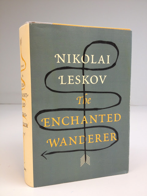 Could you describe how you created or the thinking behind a couple of my favorite covers; The Enchanted Wanderer & The Flame Alphabet?
 It’s funny, these are, of all my recent jackets, the most purely decorative—they describe almost nothing about the particulars of the book (plot, character…) but I’d say they both seek to convey something about the prose, the language itself, and the feeling of reading these (idiosyncratic) writers. Leskov’s prose are so strange, digressive, arrhythmic, odd at the sentence level, but even at the word level (there are these crazy portmanteau words in his stories, almost Joycean or Lewis Carroll-esque inventions; I frankly have no idea how Pevear and Volokhonsky translated some of these stories.) One wants to say that Leskov’s stories seem very modern, and they are modern in many ways; but there is a kind of engaging primitivism about them as well—he seems to be imitating a Russian folk demotic, but the effect is very, very new.

Ben’s work is also refreshingly, startlingly unconventional. In the case of The Flame Alphabet, I was struck with a single metaphor in the book (birds) and was taken with the idea of making the book feathered. So I made a bunch of feathers for a jacket. But it didn’t look right. So I turned the jacket
What are some of your favorite covers by other designers and why?

It seems like it would be satisfying in a tactile way as well, with the foil and the deboss, though I’ve never actually held it in the flesh (David—send me one.)
 Too often self-published books or books from publishers without much of a design budget are really hindered by their covers. What advice would you give to self-published authors, small presses, or any other amateurs who find themselves in need of a book cover? Are there some principles that will help them create good covers no matter what resources they have? Or, are book covers just one of those things you really should leave to the professionals?
 The best principle to keep in mind is: keep it simple. Most self-published book covers fail because they are trying too hard. Even design professionals fall into the trap of trying to shoe-horn too much design into one composition. I often tell students “your problem isn’t that you have poor ideas, it’s that you’ve got five ideas competing on the same page at the same time.” Simplify. If in doubt, stick with typography. Make sure the typography is legible. Use your handwriting if your handwriting is decent. If not, use a font. Any tried-and-true standard face will do (Bodoni, Baskerville, Garamond, Helvetica, Trade Gothic …) Pick a pretty color for your background. Viola. When you start to incorporate illustration, photography, etc. the amateurishness of the work begins to show. But there’s no need for any of that stuff. Many of the best book covers are as simple as could be.
There’s really no obvious reason why anyone can’t make a decent book cover—the skills required are easy to master. The tricky bits all have to do with taste and reading ability. Those parts may be a little bit harder to learn though.
Finally, what are you reading, besides what you might be working on?
A Heart So White, by Javier Marías; The Bathroom, by Jean-Philippe Toussaint; and Perdido Street Station by China Miéville.
See all of Peter’s work here, here, or here.


No comments:
Post a Comment